In the last blog (Part I), I shared steps on how we can quickly build a report in Looker Studio by connecting to a simple data source.
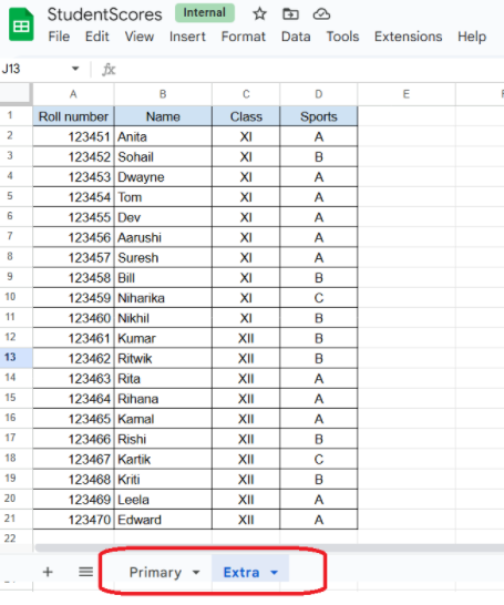
Image 1: Google Sheets with multiple worksheets
As a next step, what if the data source that we have comprises of multiple sheets. Like the example we picked “StudentScores-Google Sheets” – earlier there was just one sheet where we had subject scores for the students. Let us rename that sheet as “Primary” since it holds marks for the primary subjects. Let us add one more sheet, naming it as “Extra” that comprises of the grades for the same students for their extra-curricular activities like sports (image 1).
Now, let us open our ‘First Report’ in Looker Studio and this time add a new data source (pointing to the second sheet). Adding the source and adding widgets to the report will follow the similar process as shared in Part I.
There are two ways to add a data source-
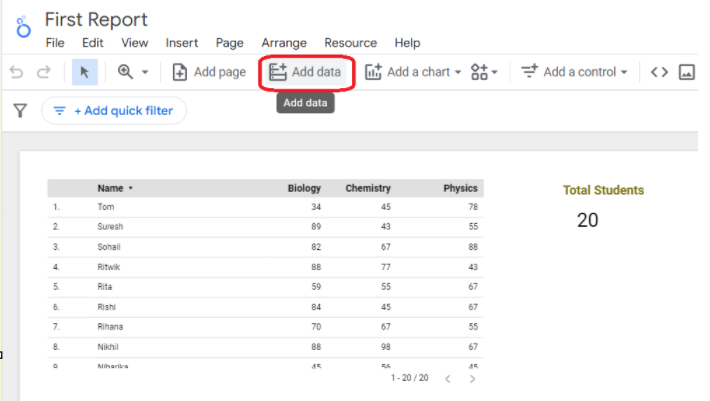
- By clicking on the “Add data” button as shown in the Image 2.
- By clicking on the menu option -“RESOURCE -> MANAGE ADDED DATA SOURCES”.
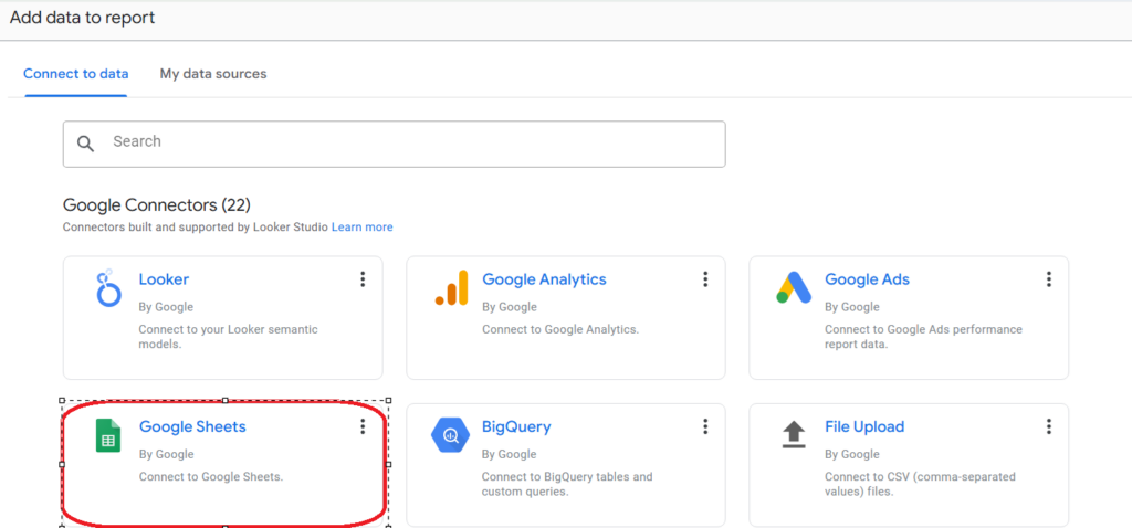
Let us click on the “ADD DATA” button (as shown in Image 2) and add the connector for Google Sheets. Do note- that Looker offers multiple other connectors to extract data from different sources. For our example, we will select Google Sheets.
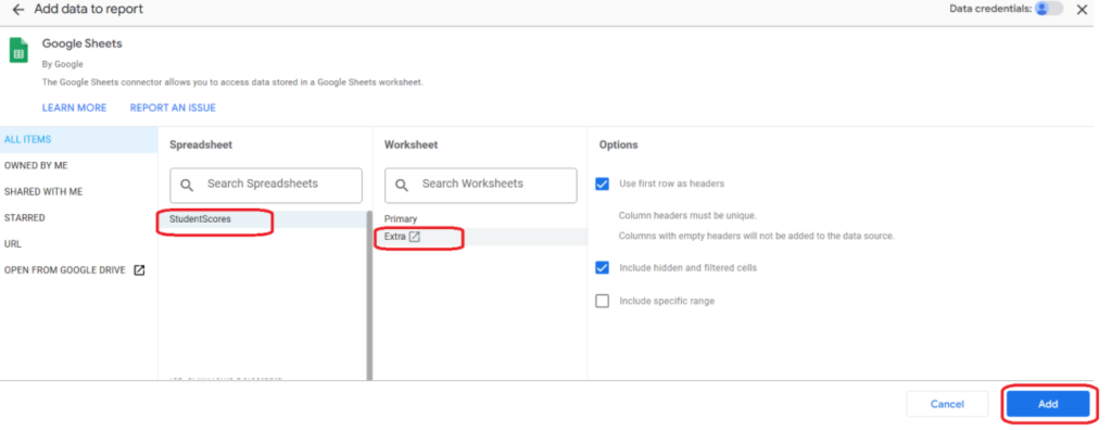
We will refer to the Google Sheet – ‘StudentScores’ and select the second sheet this time for building this new connection. . Ensure that we select the second sheet name “Extra”, as shown below Image 4 and then “Add” it to the report.
Now, we have added a new data source to the report and you will see both the source names in the DATA tab. So, we had two worksheets in a Google Sheets, and each are represented as a data source in this report. We can drag and drop any field from this new data source and setup a new widget on the existing report (as shown in Image 5).
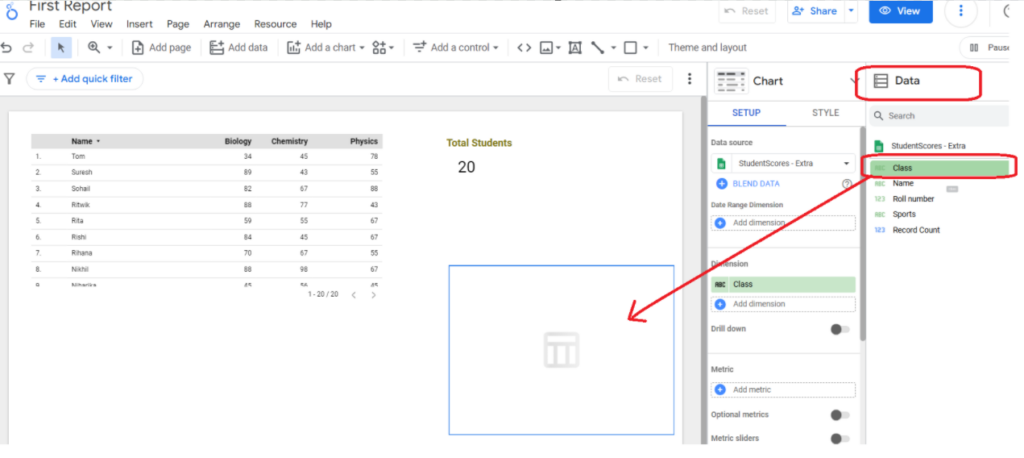
For this example, I dragged and dropped the class field on the report, it created a table structure with the class names XI and XII. I now will drag and drop the “Record count” (this one is automatically created) field on the metric dimension and I will be able to see the total students across both the classes.
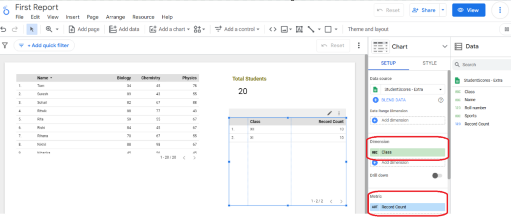
With the table selected, it is easy to resize the column size and also change the heading color or the color of the entire table from the STYLE table. So, every sheet is a connected to one data source on the report. We can have multiple data sheets as data sources on one report.
How to update the widget?
Well, that is simple, select the widget and on the SETUP panel, click on the drop down arrow to view options to update the widget style.
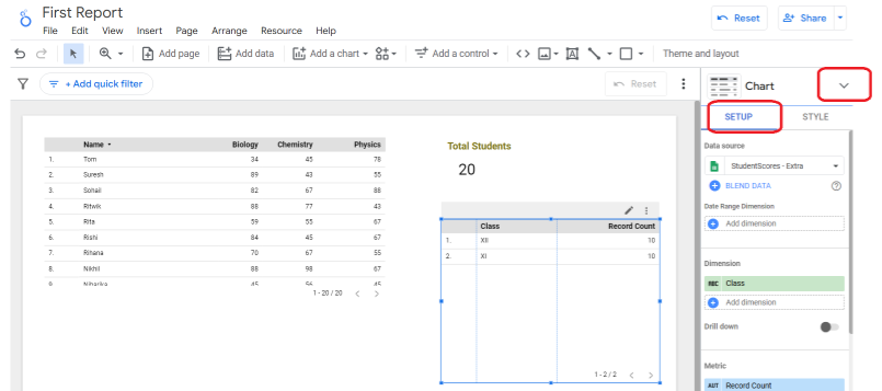
The default format is a table, let us convert this into a pie chart. Look at the options available from the drop down arrow as shown below and select the pie option to view the change-
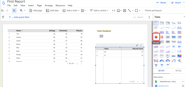
You will see that with the change in the style, the records gets updated as a pie chart on the report. You can click on the STYLE panel to further add a chart title, change the coloring scheme if needed. Do explore the other options available to update the widget (there are line charts, bar charts, scatter charts, gauge charts, inverted charts, etc). While selecting the widget type, do ask yourself on the purpose of the widget and what type of information is to published. Few tips:
a. For publishing aggregated values like record count or total records -> choose ‘scorecard’
b. For publishing entire data set -> choose ‘table’
c. For publishing distribution of records -> choose ‘pie/dooughnut’
So, choose your widget wisely 🙂
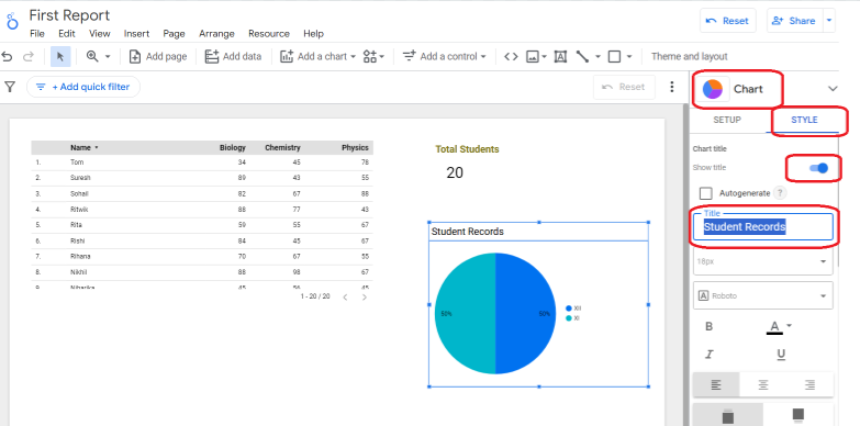
As we add widgets on the report; each one of them can be styled differently. Just select the widget and make the updates in the STYLE panel.
Summary
We start with a new report with one data source and then added more data sources as needed. Each data source gets connected to a widget on the report and it can be formatted and styled uniquely (just drag and drop). The next blog focuses on how we can blend the data from two data sources into one source provided we have a common column (data field) between them.
