When we publish data on visualization tools like Google Looker Studio, we also slice and dice data to drill through detailed trends. In my last blog, I shared an interesting feature from Looker Studio that allows users to add aggregated fields . Apart from displaying calculated data points, we need to refine data
Imagine we are exploring data in Looker Studio (click here in case you need to know about this platform). We have all the cool tables and charts, but we want to focus on specific details and make our report interactive. Consider our example where we were publishing student scores – while we view data for all students; but we would like to view data for only those students who had an average more than 80%. This is where a feature called “filtering” comes in! It is like using a magnifying glass to zoom in on the most interesting parts of your data.
In my last blog post, I talked about how we can create our own custom fields for calculations in Looker Studio (click here to read about aggregated/calculated fields). Adding to that example, let us add filters to the data that is published.
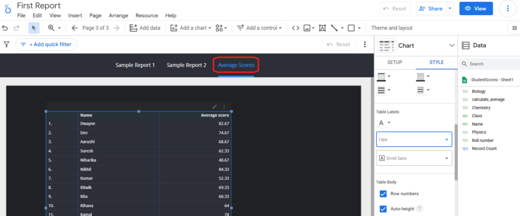
STEP 1: Let us open our ‘First Report’ in edit mode and open one of our reports – ‘Average scores’.
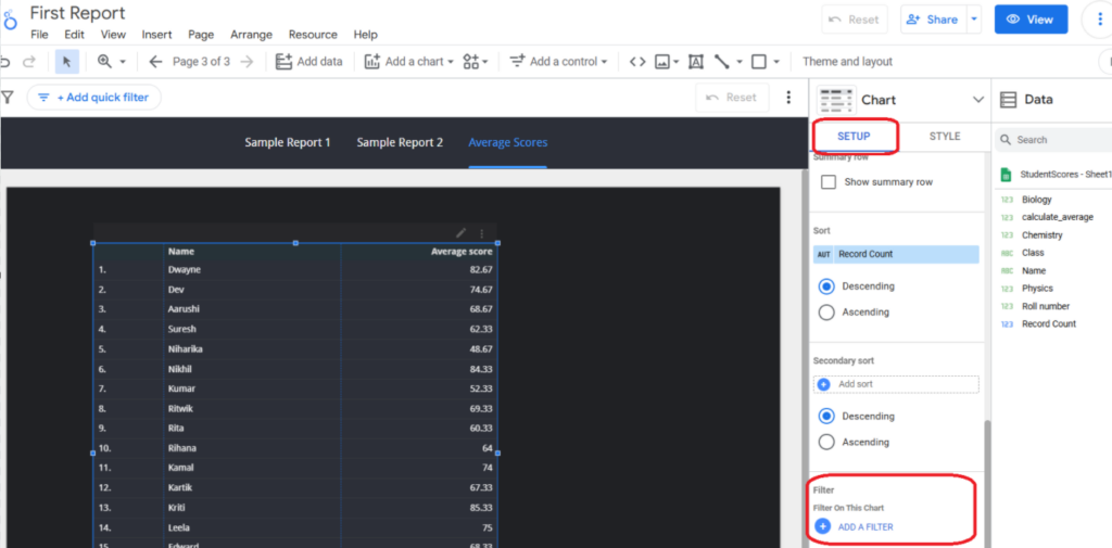
STEP 2: Select the table that is displaying the average score for all the students (as extracted from the Google Sheets). In the SETUP panel, scroll down to look out for the section named “Filter” and click on the option “ADD A FILTER”.
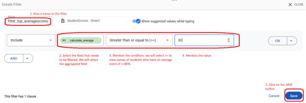
STEP 3: A window will pop up for creating a new filter, let us name it “filter_top_averagescores” as shown in Image 3. Our target is to publish names of students who have an average score of >=80%. So, we will select the field name that is to be filtered (in our case it is the calculated field that has average values). And then mention the condition. You will also notice that on the extreme left the default option is “Include”; which means that if the condition is true then the data should be displayed.
Note- If the reverse is is needed like students with low score then select “Exclude” instead of “Include”. For our example we will let the ‘Include’ value stay there. Click on the SAVE button to view the results now on the table.
On saving the filter, the window will close and you will view the updated table. Now, instead of twenty records you will only view those records where the average score is more than 80%.
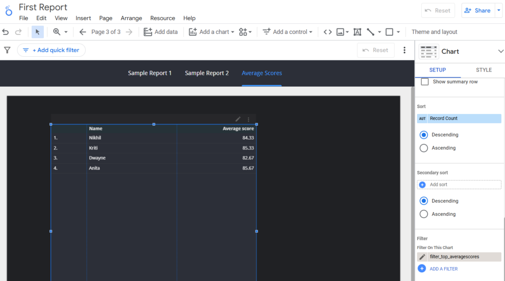
Please note–
a. You will view the filter name also in the ‘Filter’ section.
b. Once the filter is created, it can now be referred on other report components applying the same criteria. This means that once a filter is created, it can be reused again.
c. Apply filters when data is to be sliced for performing advanced analytics (so the objective should be clear).
Well, there are page level filters also that one can set on the report. For example, right now the table displays data for four students whose average score is >=80%. Now, what if we want to apply a filter on the report level with ‘Name’ as the field for filtering data. The student names are placed in a drop down control and the user selects the name of the student and now only that data is displayed in the table.
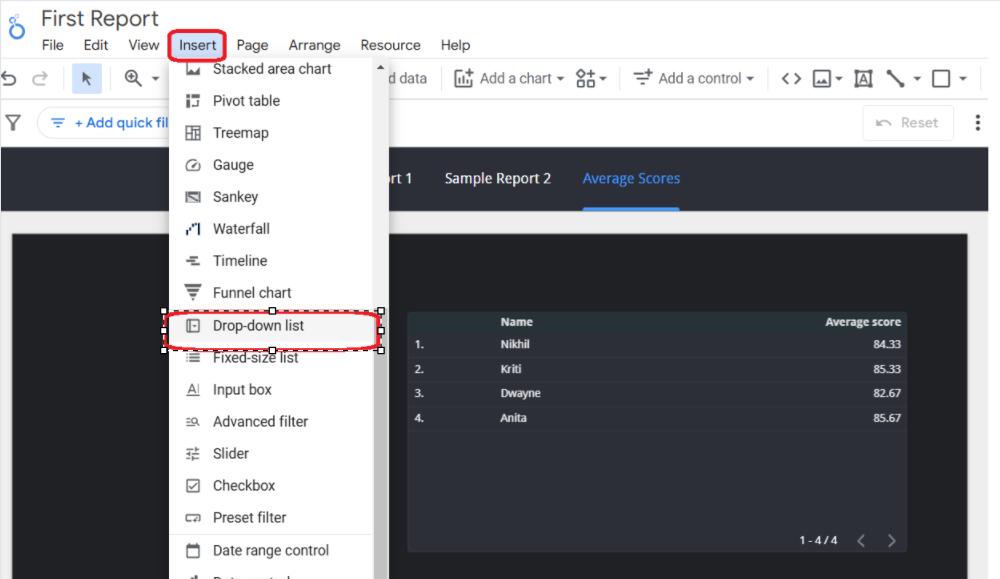
Click on the ‘Insert” menu option and select the ‘Drop-down list’ option as shown in the image below-
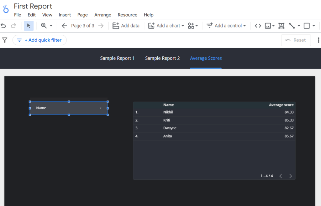
Place this selected control on the report. By default, the drop down will select the ‘name’ field from the selected data source, as shown in Image 6.
You will notice all student names in the drop down list. Let us add the filter that we created earlier from the SETUP panel as shown below-
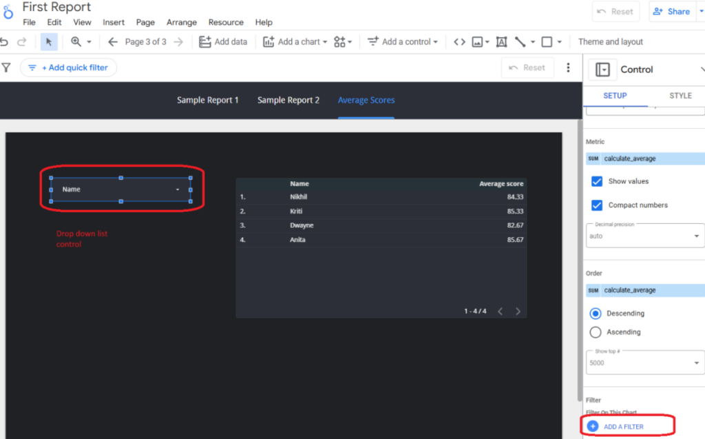
Since we have the filter ready, just select the name of the filter as shown in Image 8.
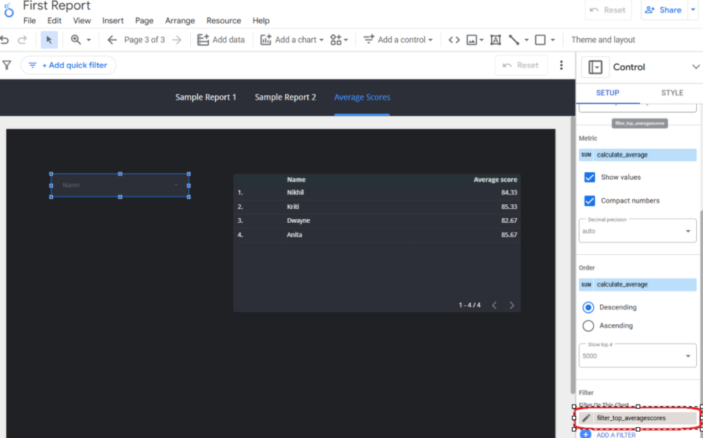
Now, you will find that only four student names are displayed in this drop down list control (after selecting the filter). Unselect all values and select only one value in this drop down list. You will see that the table also gets updated to just that one record. So, based on the selected value in the drop down list control, the table reflects only that data. If there were more widgets on the report, they too will follow the same pattern.
Also, you will notice that the drop down displays the average score also along with the student names. We can remove this field value; just select the drop down list control and delete the metric name as shown in Image 9.
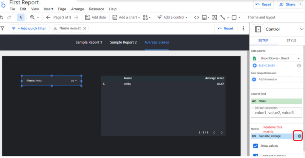
Please note-
a. Drop down list controls are useful to apply filters across all the report widgets, so choose the right set of fields that are to be applied (the dimension and the metric sections in the SETUP value should be reviewed).
b. You can have multiple drop down list controls, but the objective should be clear.
c. You can also add a label to this drop down list. Just click on the ‘Insert menu -> Text’ to add a label.
Summary–
Both filters and drop down list controls are like data exploration utilities in Looker Studio. They are useful for teams to slice and dice data for detailed analysis. The use of filters and drop down lists are useful for making the reports interactive and actionable.
Watch out for more blogs on the interesting features from Looker Studio. Do you have an interesting feature to share and would like to read more?
