Imagine a crowded street being navigated with a blindfold on. Would the journey be easy? Certainly not; it will be risky and tricky too. A similar situation arises when strategic decisions are made without the support of concrete data points. Data serves as a compass, guiding organizations through uncertainty and illuminating hidden paths. However, raw data alone can resemble a map in an unfamiliar language. This is where tools come to the rescue. With the right tools and platforms, organizations can confidently chart their course and work towards making smarter decisions.
Multiple tools are available for the creation of dashboards and reports. Several blogs detailing my experiences with tools leveraged for analytics and visualization (Power BI and Google Analytics) have been shared previously. This time, a series of blogs will be shared, focusing on another valuable tool known as Google’s Looker Studio (formerly Google Data Studio). This free and powerful tool transforms raw data into informative, interactive dashboards and reports. Let us begin with the first part of this series, in which the platform, its benefits, and the process of building a first report will be introduced.
Part 1: What is Google Looker Studio?
Google’s Looker Studio is a cloud-based business intelligence platform that helps teams / organizations to build reports and dashboards. It offers the following features and benefits:
- Connecting to different data sources: Pull data from Google Analytics, Google Ads, Google Sheets, spreadsheets, databases, and more.
- Visualizing data in multiple formats: Create compelling charts, graphs, and maps to easily identify trends and insights.
- Customize, share and collaborate: Easily customize and share reports with teams, fostering collaboration and accelerating data-driven decision-making process.
How to build a report in Google’s Looker Studio?
Building reports in Looker Studio is easy, just follow the steps below to get started-
- Start with a blank report and add the data source
- Customize the report, update the existing widget
- Add more widgets to the report
- Rename and save the report
- View and share the report with the team.
Let us deep dive quickly on each of the steps shared above.
Step 1 : Create a blank report
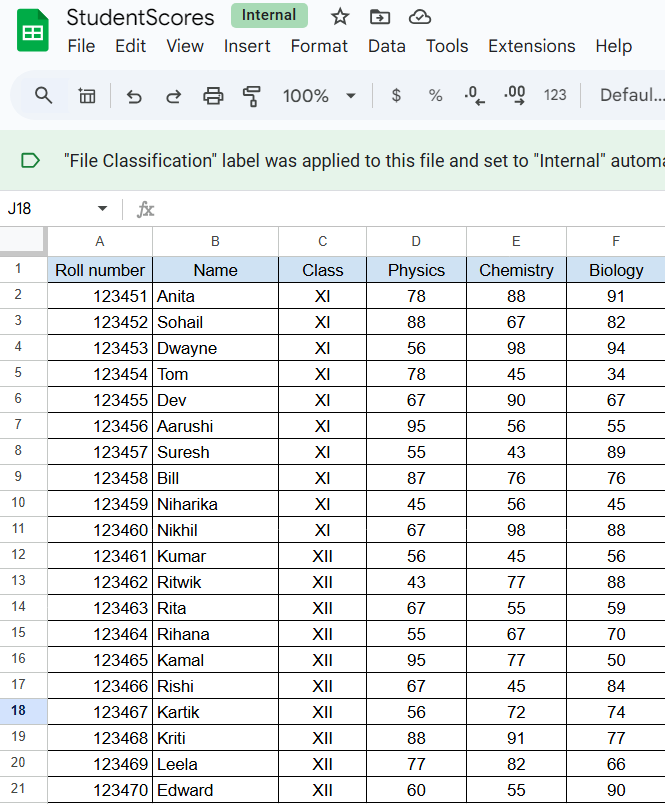
To build a report, first we need a data source. For our example, we will consider a Google Sheets. This file is called “StudentScores” and it comprises of the following sample data (as shown in Image 1).
The selected sample sheet has six columns – the student’s roll number, their name, their class and their marks in three different subjects like Physics, Chemistry and Biology.
This will be our data source that will be referred to build our first report in Looker Studio. Our first report will publish the student names and their marks.
Now, let us access Google Looker Studio, you will view options to either create a blank report or use an existing template to build a report.
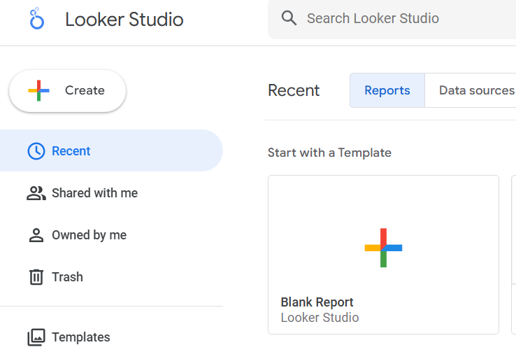
For this Part 1 of this blog series, we will start building a report from scratch. Click on the option “Blank Report”. You will be prompted to select the data source, let us select the “Google Sheets” option as shown below-
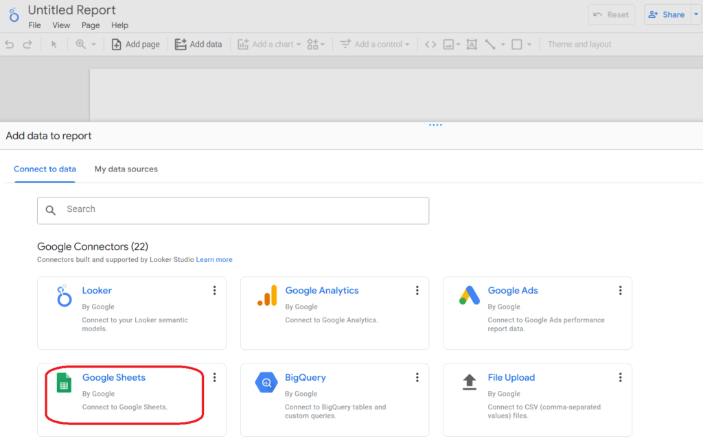
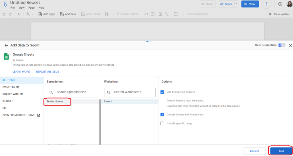
Browse for the sheet name, to select our data source – StudentScores. After selecting the file name, you will be able to see the sheets (Sheet1) available in that worksheet. One workbook can have multiple worksheets, so it is important that the sheet name is selected at this time. We only had one worksheet, so the default is selected. We will click on the “Add” button as shown below-
Now, we have our data set connected to our first report. You will be able to see a report named by default as “Untitled” and also a widget is published on the report as shown below.
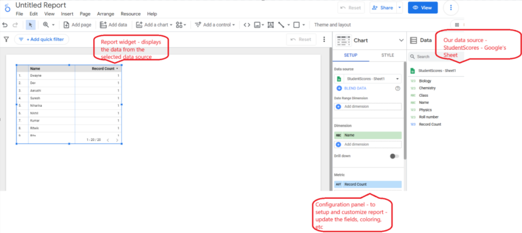
There are three sections that you will view – the report on the left side where you will see a default table published from the data source we had selected. Next to the report section, you will find the configuration section where you will view the source name and change the styling like color, font names, fields to be published, etc. And the last section towards the right side is the Data panel – where the source name and fields will be displayed.
Step 2 : Customize the first widget
If you look at the default table on the report, it shows the student name and the record count. But we need to publish the student names with their marks. Ensure that the default table is selected (the one that has student name and record count), if you look at the config panel, the metric section (in the SETUP tab) shows “Record Count”, remove that.
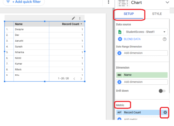
Drag the field names from the Data panel and drop them on this metric section in the Setup panel as shown below-
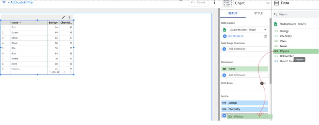
As you drag and drop the fields in the metrics section, you will see the table on the report gets updated. The tabular report on the report shows student names and their marks in three of the subjects. You can select the table and resize the table and the fields.
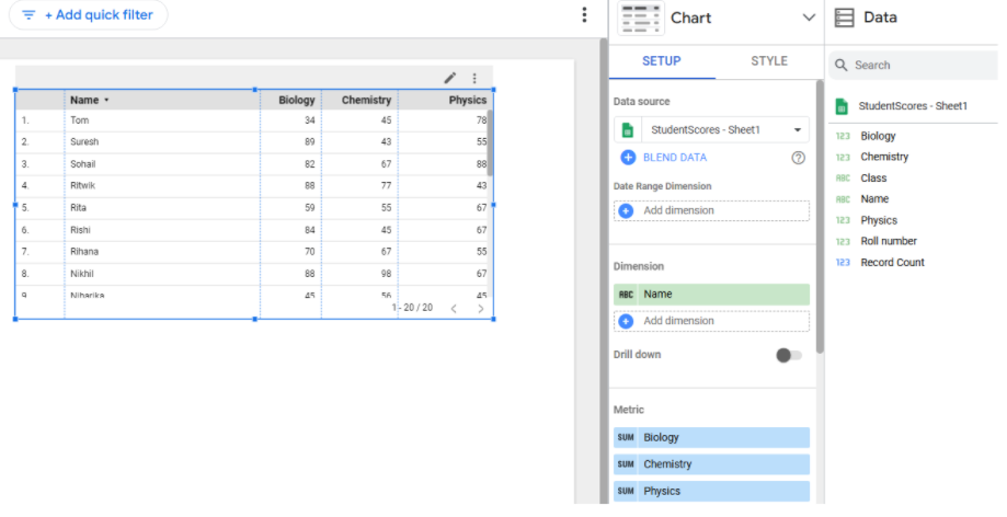
Step 3 : Add new widgets in the report
Our first report is ready with one data source and one report widget. Let us now add another widget wherein we will publish the total students. Click somewhere on the white space in the report, you will see that the Setup section is not visible. This is because there is no widget added on the report. Drag and drop the record count (this is default field generated by Looker for every data source) on the report, next to the table.

Looker Studio will publish the total record count on the report. This is the second widget on the report, it will display the total count, that is 20 at the moment. With the newly selected widget, let us rename the widget, click on the STYLE table in the config panel as shown below –

You can click on the “Show Title” option in the STYLE tab and update the widget name to “Total Students”.

Remember: To style/format any widget on the report, ensure that the widget is selected and update the options in the STYLE tab in the config panel. We still would find the “Record Count” option under the title name, let us hide this option and only display the title that we had published. With the widget selected, scroll down in the STYLE panel and look out for the option saying “Hide field name”.
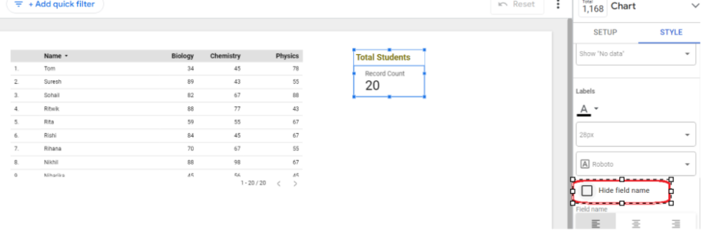
Select this option, this will remove the “Record Count” text from the widget, the view will be refreshed as shown below-

Step 4 : Rename the first report
We have two widgets on our first report, now let us rename our report. Click on the “Untitled Report” section (on top left corner) and add a new report name -“First Report”.

Step 5 : View the report and share
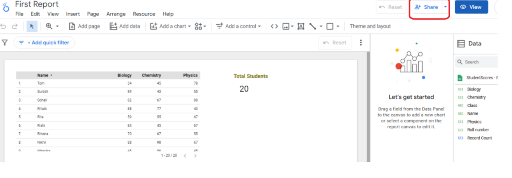
Now, our first report is ready. Click on the button “View” as shown below; to view the report.
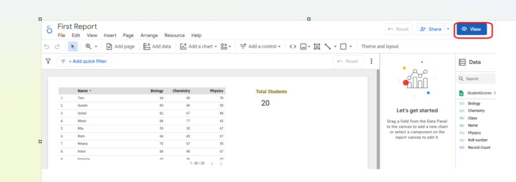
As a final step in this first part of the blog series, we will share this report with our team members. Click on the “Share” button and add the email ids of the team members who can access and view your first report.
Summary
Well, we just published our first Looker Studio report. We dived through the steps to adding a data source, customizing widgets and the style, renaming and then sharing the report with the team. There are many more interesting options available to build an engaging report or to say a dashboard.
Feel free to explore my other blogs that walks through the experiences of refining the reports in Looker Studio.
Add new reports and change report theme and layout: Part 4


